Branding · 3D · Print & digital · 2021–2022Branding · 3D · Print & digital · 2021–2022Branding · 3D · Print & digital · 2021–2022Branding · 3D · Print & digital · 2021–2022Branding · 3D · Print & digital · 2021–2022Branding · 3D · Print & digital · 2021–2022Branding · 3D · Print & digital · 2021–2022Branding · 3D · Print & digital · 2021–2022Branding · 3D · Print & digital · 2021–2022Branding · 3D · Print & digital · 2021–2022Branding · 3D · Print & digital · 2021–2022Branding · 3D · Print & digital · 2021–2022Branding · 3D · Print & digital · 2021–2022Branding · 3D · Print & digital · 2021–2022Branding · 3D · Print & digital · 2021–2022Branding · 3D · Print & digital · 2021–2022Branding · 3D · Print & digital · 2021–2022Branding · 3D · Print & digital · 2021–2022Branding · 3D · Print & digital · 2021–2022Branding · 3D · Print & digital · 2021–2022Branding · 3D · Print & digital · 2021–2022Branding · 3D · Print & digital · 2021–2022Branding · 3D · Print & digital · 2021–2022Branding · 3D · Print & digital · 2021–2022Branding · 3D · Print & digital · 2021–2022Branding · 3D · Print & digital · 2021–2022Branding · 3D · Print & digital · 2021–2022Branding · 3D · Print & digital · 2021–2022
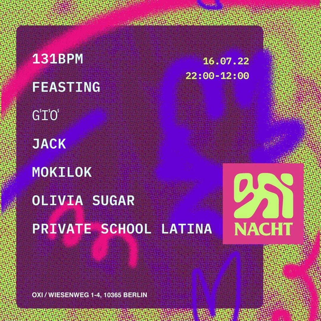
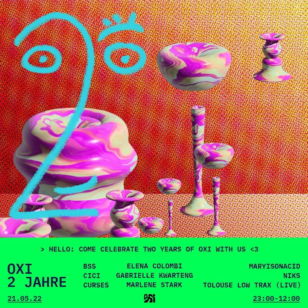
In collaboration with the booking team, the visual language leaned into bold color and playful 3D type, giving the venue a distinct identity that stood out in a crowded scene of monochrome techno branding.
This included the menu design, which featured hand drawn illustrations, giving something as ordinary as a drink list its own personality instead of feeling like an afterthought.
The social media visuals went a similar route: hand drawn caricatures, fine art aesthetics, motion design, and gritty textural backgrounds, so the feed felt more like a mood board than a marketing calendar.